
Investment Scenario Lab is a learning tool for understanding the variables that shape investing.
You run scenarios with made-up numbers and watch how the inputs interplay to produce possible outcomes. This is the story of how I built it, the choices behind the model, and why the best decisions were subtractions.
- 7 wksconcept to shipped
- 45decisions logged
- 7test personas
- 1real-user spreadsheet compared
- 76automated checks
- 0AI in the product
What it is
A calculator for investing intuition
It is a learning tool where people can understand the variables that affect investing. It lets learners run scenarios with fictitious numbers to gain greater understanding of how those variables may interplay to produce investment outcomes. It is not a forecaster or a fiduciary advisor. It is more like a calculator, where the user runs inputs and levers to generate possible outcomes. There are an infinite number of outcomes, and they are all determined by the infinite number of inputs. Play with it to gain a much deeper understanding of investing. Save scenarios and compare them. This is a broad tool to learn before a person goes to a fiduciary advisor and puts together a plan.
Everything it shows is a hypothetical illustration of the numbers you enter. It computes and explains; it does not counsel. That principle shaped the architecture, the wording, the visuals, and, more than once, what I chose to remove.
How I think
Five principles that decided the close calls
Honesty is a feature, not a disclaimer
The tool should not hold an opinion about the market and slip it past the person using it. If a model can flatter, it will, so the humble view has to be structural rather than optional.
In practice: the app takes no valuation view of its own. Returns come entirely from the user's own mix applied to published long-run averages, and crash years are built into every simulation. Where the model has to make a judgment call, the Method page names it as a judgment call instead of implying the number was measured.
Make the hard thing simple, keep the depth
Beginners and careful readers are the same person on different days. The answer is progressive disclosure, not dumbing down.
In practice: the interface began dense and became a single at-a-glance screen. The rich learning stayed; it just stopped arriving all at once.
Plain language over jargon
If an eighteen-year-old cannot read it on a phone, it is not done. The math can be sophisticated; the words cannot be.
In practice: the results lead with three plain numbers, what you would have if unlucky, in the middle, and if lucky, with the biggest drop along the way named as exactly that. Where a technical term earns its place, like median, it is used honestly rather than softened into something that sounds like a prediction.
Safety is a build gate, not a promise
A rule you merely intend to follow is a rule you will eventually break. Encode it so the build fails when you slip.
In practice: an automated ship check blocks any release that names a specific security, verifies the downloadable model against a pinned fingerprint, and free use carries a $0 liability cap by design.
Decide with evidence, then verify
Opinions start the conversation; tests end it. And every change should be reversible, so I never ship what I cannot cleanly undo.
In practice: 76 automated checks and pinned math snapshots guard against silent regressions, so any change to a modelling assumption shows up as a measurable, reviewable difference rather than a quiet drift.
The through-line: restraint, made concrete
Each principle is the same instinct pointed at a different surface: protect the person using the tool. The craft was turning that instinct into architecture, wording, and tests that hold the line without my supervision.
The transformation
From dense and overwhelming to clear at a glance
The first builds tried to show everything at once. Powerful, and exhausting. I first split it into a two-column workspace, inputs on one side and results on the other. Then, round after round of testing, I pulled the results onto their own page: one calm screen that reads in a single downward glance. Same tool, same math, three acts.
June, Investment Roadmap
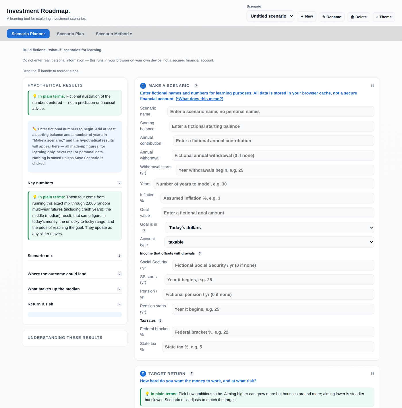
Everything, all at once
One long page, inputs and results competing for the same space, a 4,100px scroll with every control open.
July, Scenario Lab
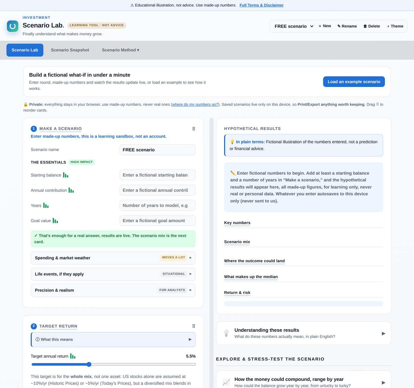
Split into a workspace
Renamed and re-laid out. Inputs on the left, live results on the right, and the scroll cut by more than a third.
Now
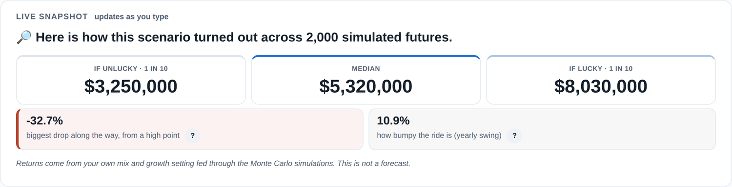
One calm answer
Results moved to their own page and open with three outcomes of equal weight, with the risk you would have lived through sitting directly beneath them.
Both the inputs and the results found their own calm space instead of fighting for one screen. I simplified the navigation into a single How and Method menu, and added small moments of joy, charts that rise in, a headline that counts up, all of it off when reduced motion is set.
The last act was mostly deletion, and it was the hardest. A target-return slider, a pass-or-fail goal score, an allocation donut, and a second money figure in today's dollars all came out. Every one of them was something I had built and liked.
The spreadsheet test
A real user brought their own model, and their questions rebuilt mine
Persona testing is useful, but it has a ceiling: the personas do not arrive holding a financial model they already trust. One target user did. They shared the spreadsheet they actually used to think about their money, and I brought it in alongside the app so the two could be run against each other and talked through together.
What made the difference was not the numbers lining up. It was the questions. Sitting with someone who already has a working mental model surfaces every place your version fails to connect to it, and those questions became the specification for what to change.
Three kinds of change came out of it. Levers came out. Controls I had kept because they were interesting to me turned out to be noise to the person actually using the thing, and the honest response to a control nobody can act on is to delete it rather than explain it harder. Inputs were reconsidered. Some of what the model needed was sitting in a settings panel when it was really a plain question about the user, so it moved to the front and got asked in plain words. Explanations were rewritten. Wording that read as obvious to me read as jargon out loud, which is a fast and slightly humbling way to find out.
The answer to a spreadsheet user is a spreadsheet
The deepest question was the one underneath all the others: why should I believe this over the sheet I built myself? That is a fair challenge, and no amount of explanatory copy really answers it. Someone who models their own money trusts their spreadsheet because they can see every formula.
So the product now gives them one. The app exports a live Monte Carlo workbook with every formula visible and editable, using only standard spreadsheet functions, no macros and no add-ins. A person can open it, trace the math, change an assumption, press recalculate, and check the app against its own engine. The transparency principle stops being a claim on a page and becomes a file they can audit.
Where the numbers land
The results, on one calm page
Every comparison is drawn so that more upside visibly costs more risk. That is a design decision as much as a modelling one: if the picture makes an aggressive mix look like a free win, the picture is lying.
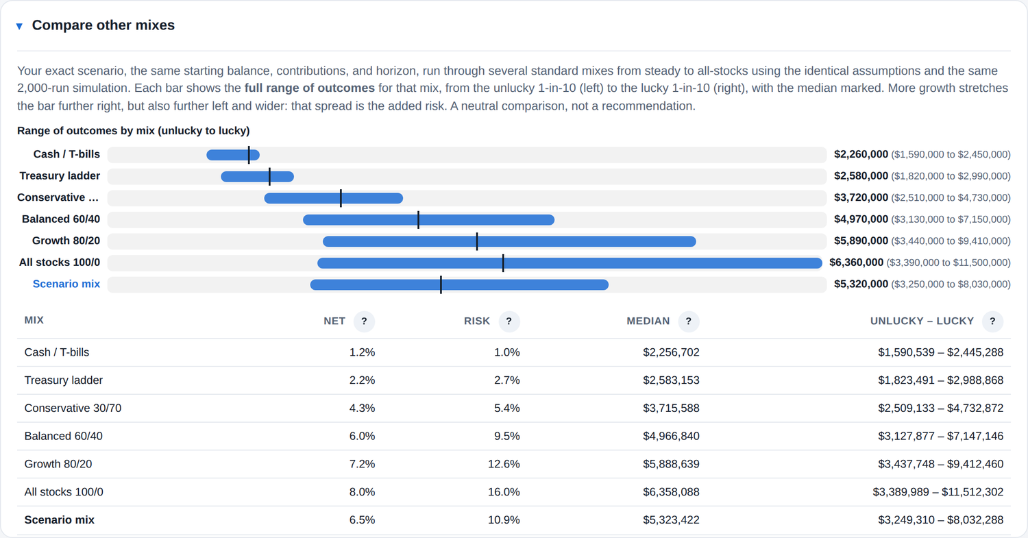
Comparing mixes. Each bar spans the unlucky tenth to the lucky ninetieth with the median marked, so a higher-growth mix reads as wider and riskier rather than simply taller.
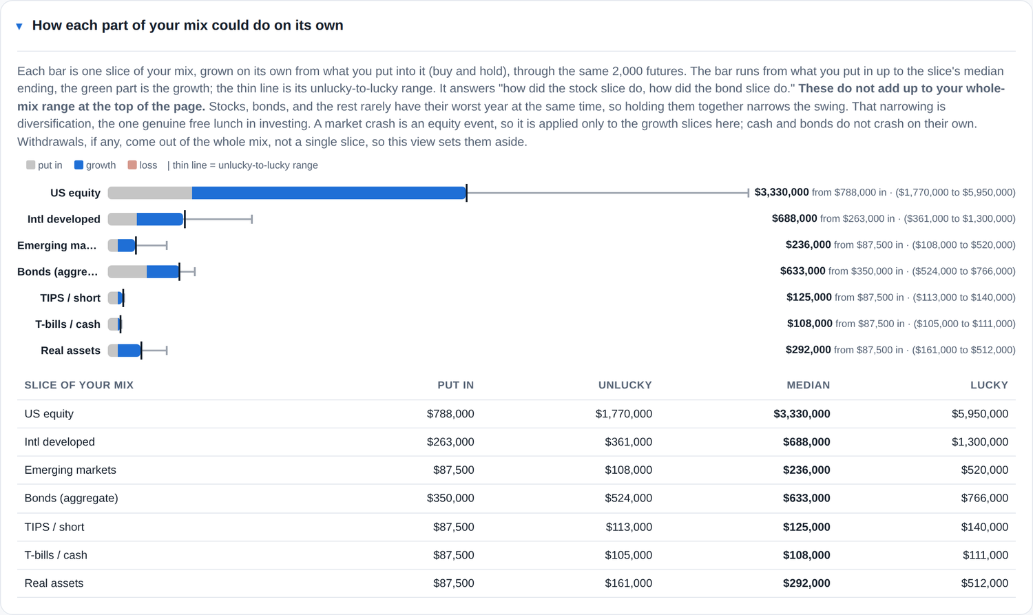
Diversification, made visible. Each slice is simulated on its own, and the page says plainly that the parts do not sum to the whole, because the classes rarely have their worst year together. That gap is the point.
The model
The choices behind the numbers
A calculator like this rests on a handful of settings that quietly decide every result. I took the view that each one should be chosen for a stated reason, published in plain language, and adjustable by anyone who disagrees with me. Three decisions mattered most.
Crash years: 4% a year
Expected returns are long-run averages, and averages already contain crashes. What an average cannot carry is the shape of one. It is like saying a city averages 60 degrees: true, and it already includes winter, but a smooth bell curve around 60 will tell you it essentially never freezes. Some winters it does.
Left alone, a bell curve makes a −30% year a one-in-215 event. The actual record from 1928 to 2024 shows one in thirty-two. So the model adds explicit crash years, set at 4% annually. That figure is not a hunch: three of those ninety-seven years were worse than −30%, which is 3.1%, and an international study covering three thousand country-years puts the rate near 3.2%. I chose 4% to sit slightly above both and err toward caution.
The page also states the uncomfortable part: with only three events, the honest range around that number runs from roughly 0.6% to 9%. It cannot be pinned to a decimal place, and saying so is more useful than pretending otherwise.
Mean reversion: deliberately mild
Mean reversion is the assumption that markets partly walk back big moves over several years, so a crash is not permanent. It is genuinely contested. Some well-known research supports it; other research finds the effect sits largely in the 1930s and 40s and has weakened since, and one influential paper argues that once you account for not knowing the true long-run return, stocks are riskier over long horizons rather than safer.
Studies that do estimate a speed across a century and many countries put the half-life near eighteen years. I set the tool to a half-life of about fourteen, close to that estimate rather than far beyond it. The setting barely moves the middle result but strongly lifts the unlucky one, which is exactly why I chose the cautious end: where evidence is contested, I would rather present a wider range than a reassuring one.
The Method page labels this a modelling judgment rather than a measured constant, and shows the research on both sides so a reader can disagree with me on the evidence.
One engine, not a choice of engines
There is a respected alternative to this kind of simulation: replaying real historical sequences instead of generating years from a distribution. I built it, then removed it. It could not use the published return assumptions, it collapsed seven asset classes into three, and it drew on a sample short enough to miss the Depression and the 1970s entirely.
The deciding factor was that switching between the two could move a result substantially while the return and risk figures on screen, which are calculated from the assumptions, did not move at all. A control that can quietly change the answer while the explanation stays put is not a feature. The long historical record now serves as the evidence the single engine is calibrated against, which is a better use for it.
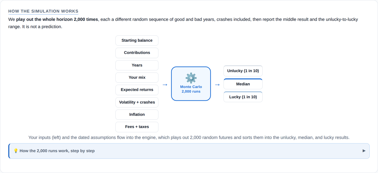
The engine, shown rather than described. Every input that feeds the simulation, and the three results that come out.
Pivots
Where I changed direction, and why
A pivot is only worth logging if the reason is clear. Each of these was a case of new information beating my earlier plan.
| From | To | Why |
|---|---|---|
| Investment Roadmap | Investment Scenario Lab | A roadmap implies a single recommended route. A lab is a place to explore and compare. The rename matched the tool's real purpose: somewhere to learn by running scenarios, before you sit down with a professional to make a plan. |
| A dense screen showing everything | A single at-a-glance screen | Testing showed the depth was a wall, not a gift, when it all arrived at once. Consolidating to one scannable screen kept every capability while making the first impression calm and readable. |
| A target-return slider and a goal score | Explore the mix instead | Dialling in the return you wish you had is a fiction, and grading a scenario pass or fail invites false precision. The honest control is the mix itself, so the target slider and the goal gauge both came out. |
| Two money figures, dollars and buying power | One money figure | A second inflation-adjusted number beside the first read as a competing answer rather than a clarification. One figure, in future dollars, with the Method page explaining exactly what inflation does and does not affect. |
| Nominal, real, median jargon | Plain language, kept honest | The goal was for an eighteen-year-old to understand it on a phone. Most jargon went; median stayed, because softening it into something friendlier would have made a range sound like a prediction. |
| An auto-renewing subscription | A one-time yearly fee | The honesty principle applies to pricing too. A one-time annual fee with no auto-renewal means no surprise charges and nothing to cancel, which fits a product built to be trusted. |
How it was built
AI was my build partner. There is no AI inside the product.
The project began where all my builds do, with my own product-template: a planning prompt harness that turns an idea into a clear spec, constraints, and a plan before a line of code. From there I used AI to build and test faster and more thoroughly than I could alone, with my own judgment steering every call. What ships to the user is transparent, auditable math. No model, no black box, no AI in the product. A person can trace every number to a formula.
Julie Clarkson
Direction, product judgment, and every decision about what to keep, cut, and ship. The accountable human on all of it.
Claude, build and test partner
Paired with me to design, write, review, and stress-test the work, to research the evidence behind each modelling assumption, and to hold the safety and honesty rules I set.
Claude Agentic Product Testers
My testing crew: seven personas plus an output critic that pressure-tested the interface on real rendered screens, on mobile and desktop.
Claude Agentic Network
My implementation network that turned the test findings into fixes on a working branch, so improvement moved as fast as testing did.
The arc, in loops
This was built the way good products are: iteratively
Test, improve, retest, and again. Nothing here arrived fully formed; it converged through rounds.
Late June 2026
From a plan harness to a foundation
Kicked off from my product-template, a reusable planning prompt harness that specs the product before any code. Then set the non-negotiables: a transparent client-side engine, a light default theme, and a strict rule that it names no securities and stays a learning tool.
Mid July
First usability round
Put the dense early build in front of the test personas and learned, plainly, that the depth was overwhelming newcomers.
Early August
Test, improve, retest at scale
Ran the personas and output critic across mobile and desktop on real screenshots, had the network implement fixes on a branch, then retested. The goal: keep the depth, make it phone-simple.
Early August
Single at-a-glance screen, plain money, joy
Consolidated the results into one scannable view, rewrote the headline as real dollars, simplified the menu, and added tasteful motion. Rebuilt the charts as dynamic in-code graphics using Canva as style inspiration.
August 10
Four-lens review
Reviewed for liability and accuracy through four expert lenses, tightened the terms, and moved pricing to a one-time yearly fee.
August 14
The neutral calculator
Removed the app's own opinions about the market, along with the target-return slider and the pass-or-fail goal score. Rebuilt the results to lead with three co-equal outcomes and to show the biggest drop along the way beside the upside, so a higher-growth mix can no longer read as a free win.
August 15
Settling the model
Fixed the modelling assumptions in place with stated reasons: the crash rate calibrated to the historical record, mean reversion set at the cautious end of contested research and labelled as a judgment, and a single simulation engine rather than a switch between two.
How I keep it honest
The work is only done when the gate says so
Every change runs the same gauntlet before it ships. Nothing reaches the app on judgment alone.
- A suite of automated checks across the engine and views
- Pinned math snapshots that fail the build on any unintended change
- A ship check that blocks named securities from the public build
- Download-integrity verification against a pinned fingerprint
- An assumptions freshness guard that forces a review every six months
- Independent numeric re-verification of the core formulas
76 checks passing, zero failing.
What it demonstrates
How I build
I orchestrate a lot of capability, AI partners, agent testers, an implementation network, automated gates, and I stay the one accountable for the calls. I move fast without shipping things I cannot roll back. I treat safety and honesty as features to engineer rather than claims to make. And I am willing to reverse my own decision the moment the evidence turns.
The restraint is not caution for its own sake. It is respect for the person on the other side of the screen.
- Product strategy
- AI orchestration
- Iterative UX
- Design systems
- Plain-language writing
- Test-gated delivery
- Quantitative validation
The best decisions in this project were subtractions. That is usually the case.
Investment Scenario Lab is an educational illustration tool, not investment, tax, or legal advice. Case study by Julie Clarkson.