
Case study · Applied AI product build
Retirement Scenario Lab
Turning a dense, intimidating retirement prototype into a calm, trustworthy teaching tool. One that helps mid‑life savers and curious young adults run real scenarios and actually understand what makes their money last. Built and stress‑tested with an agentic AI network, and shipping something deliberately old‑fashioned under the hood: transparent math, and not a shred of AI in the product itself.
A free, privacy‑first Monte‑Carlo retirement simulator. Single‑file vanilla‑JS web app, no accounts, nothing leaves your device, deployed on Vercel.
The problem
Rich, honest, and completely overwhelming
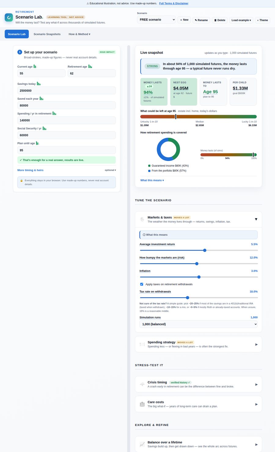
Retirement Scenario Lab does something genuinely useful. It runs thousands of simulated futures against the numbers you enter and shows how often the money lasts, what might be left behind, and which choices move the outcome most. The engine was sound and the disclosures were careful. But the first build tried to show all of it, at once. Inputs and outputs interleaved on one long page, a wall of expert modules, a giant chart, and jargon everywhere.
My goal set a high bar. The tool had to be genuinely clear and usable on a phone, so a mid‑life saver or a young adult could explore real scenarios and learn the variables behind retirement, no finance background required, without sanding away the depth that made it worth using. That tension, keep the richness and lose the intimidation, drove every decision that followed.
The one non‑negotiable, stated up front:
AI was my build‑and‑test partner. It is not in the product. The shipped tool is a self‑contained Monte‑Carlo engine, plain and inspectable arithmetic that runs entirely in your browser. No model, no inference, no data leaving the device. In a category crowded with "AI‑powered" black boxes, the honesty of "it is just math, and here is the math" became a feature.
Before and after
Same engine, two very different experiences
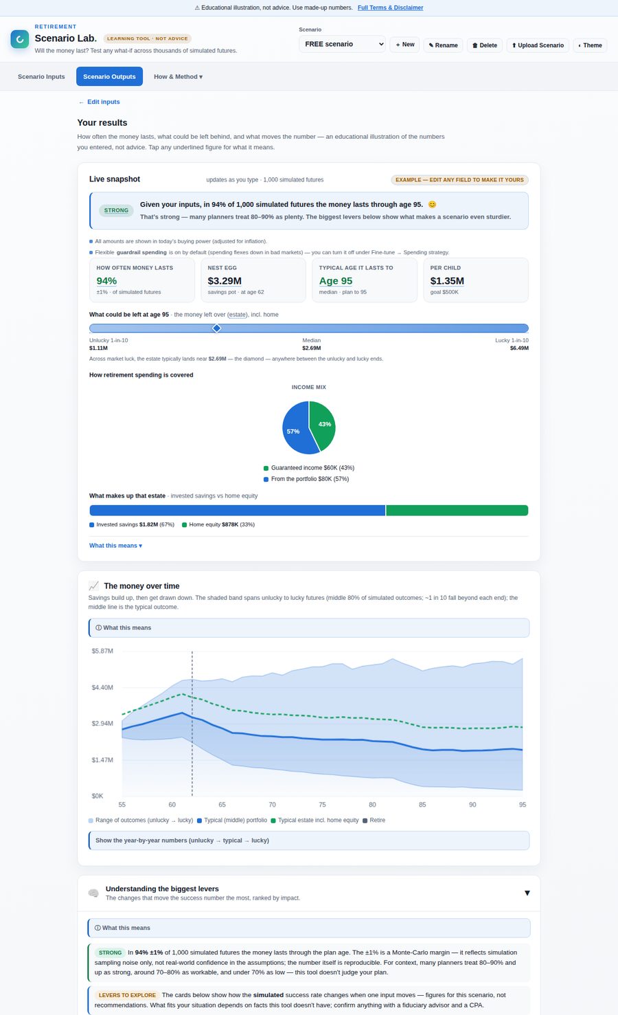
Left: the original single dense page, with inputs and outputs fighting for the same space. Right: the redesigned two‑page tool, calm at a glance with the depth one tap away.
How it was built
A plan harness, a build network, and a test panel
This did not start from a blank page. It started from my plan‑prompt harness in product‑template, a structured way of turning an intent into a scoped, reviewable plan before a single line changes. From there the work ran as an agentic loop:
- The Claude Agentic Network did the building. Engineering agents reorganized the app, redrew the charts, rewrote copy, and rewired logic, each held to a hard rule: the frozen Monte‑Carlo engine had to keep passing its 30 self‑tests, and every element ID had to survive.
- My Claude Agentic Product Testers did the judging. A panel of personas (a first‑time saver, a time‑pressured mobile user, an accessibility‑reliant user, a power user) exercised the app on mobile and desktop and scored it honestly. Their retest is where the 4 to 7.5 usability jump came from. Later, the same persona approach turned inward and took on expert lenses to pressure‑test accuracy and liability on the build side.
- Claude orchestrated the two, turning findings into build specs, verifying every change by rendering the real pages headlessly, and refusing to mark a milestone it had not actually confirmed.
Every meaningful decision was auto‑captured as it happened, a running design‑decision log that made this very case study possible to write from the record rather than from memory.
The pivots
Six decisions that changed the product
The redesign was not one big rewrite. It was a sequence of specific, testable bets, each one shipped, retested, and kept or corrected.
One dense page becomes two calm pages
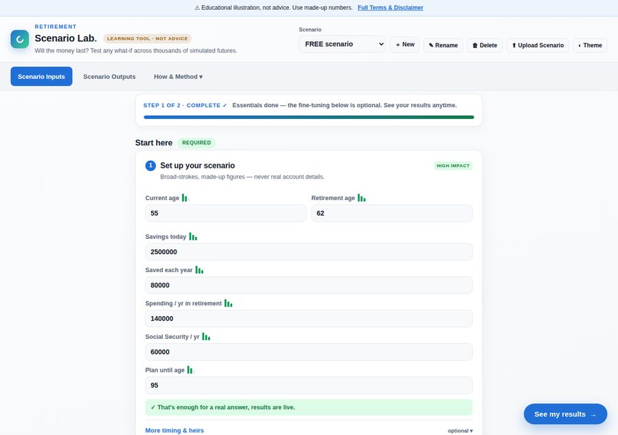
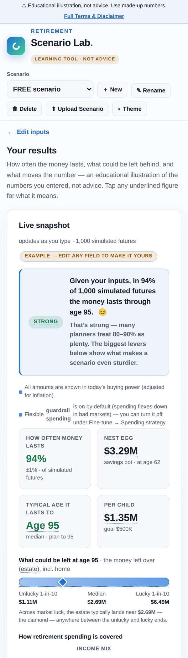
The single biggest move: split the tool into a progressive Inputs form (required first, "fine‑tune" collapsed) and an outputs‑only Outputs dashboard, joined by a live "See my results" button. The engine and every ID stayed put; the panels just moved. First‑time ease jumped from 4 to 7.5, and the time‑pressured mobile score from 3 to 7.
Kill the confusing money "basis"
The app quietly mixed two money systems. A chart topping out near $18M in future dollars sat beside a $1.3M estate in today's dollars, and it read as broken. We removed the "fixed nominal" option entirely (it made plans look safer than they are), deflated everything to today's buying power, and replaced a wall of "· today's dollars" tags with a single honest note. Fewer choices, more trust.
Charts as one on‑brand family
I pulled in Canva's graph gallery as visual reference for what "friendly and clear" looks like, then we built the real thing natively, with no static image exports. Every chart moved onto one brand palette (blue to green), the too‑faint money‑over‑time chart got bolder lines and a visible range band, and the dull slider bars became a semicircular "money‑lasts" gauge and a bullet estate range. Crucially, the palette was run through a colorblind‑safety validator before it shipped, not eyeballed.
Trying to add joy
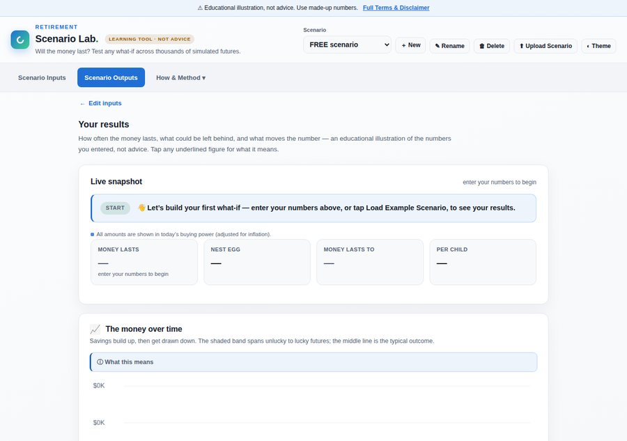
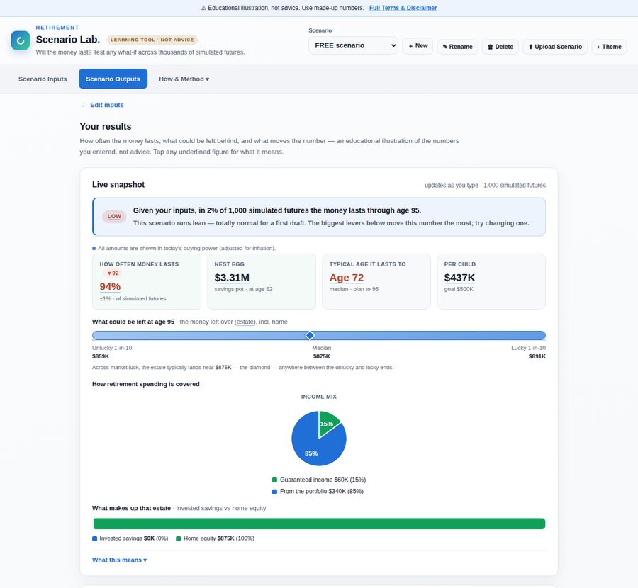
Retirement math can feel heavy and intimidating, so we deliberately engineered small moments of warmth: a 👋 wave on the empty state, confetti when a genuine edit crosses into a strong plan, a "Nice work!" nudge when the essentials are done, and a friendly face on a strong verdict. Then came a careful correction. The tool celebrated winning generously but coached losing coldly. So the verdict learned to speak to every result kindly ("This scenario runs lean, totally normal for a first draft; here is the lever that moves it most"), it started rewarding the relief of climbing out of the red, and the joy was scoped to celebrate learning, never the money, with every animation silent under "reduce motion."
Less on screen, by default
A four‑lens review (information architecture, a first‑time‑user usability pass, emotional design, and accessibility) found the same thing four ways: the page was still doing too much. We collapsed the roughly 40‑row year‑by‑year table behind a toggle, removed a redundant third copy of the headline number, renamed two look‑alike KPIs, and moved the "what changes my number?" section above an advanced edge case. Nothing was deleted, just sequenced.
Accuracy and liability, before promoting it
Before putting marketing behind it, the same persona‑testing approach was turned on the build itself. Reviewers took on expert lenses (legal and compliance, economics, statistics, and financial planning) and read the product line by line. It caught real things: a withdrawal‑rate figure that ignored Social Security, a "consult a fiduciary and a CPA" line that only appeared on weak plans, and marketing that oversold the method. We fixed the math, made the "not advice" line appear on every result, matched the marketing to the methodology, and put the whole product on one honest footing: not a fiduciary, not responsible for outputs, and explicitly not a forecaster.
The result, in the details
Calm at a glance, deep on demand, kind by design
A few moments from the finished tool.
What made it work
The method, not just the pixels
The interesting part of this build is not any single screen. It is how it was made. A human setting direction and making the judgment calls, an AI network doing the building and an AI panel doing the testing, a frozen engine and a 30‑test gate keeping quality honest through six fast iterations, and a decision log capturing the "why" as it happened. It let a solo builder move like a team without ever losing the thread.
And it reinforced the product's own thesis. The same rigor that made the build trustworthy (verify everything, show your work, do not claim what you did not check) is exactly what the product promises its users: transparent math, no black box, and an honest account of what it can and cannot tell you.
Credits and colophon
How this was made
- Direction and decisions
- Julie Clarkson. Vision, goals, and every keep‑or‑correct call.
- Starting point
- My plan‑prompt harness from product‑template. Intent to scoped, reviewable plan.
- Build partner
- The Claude Agentic Network. Engineering agents that built, redrew, and rewired.
- Test partner
- My Claude Agentic Product Testers. A persona panel that scored usability on mobile and desktop, and took on expert lenses to pressure‑test accuracy and liability.
- Orchestration
- Claude. Turning findings into specs, verifying by rendering, and holding the quality gate.
- Visual reference
- Canva's graph gallery. Inspiration for the chart family, built natively and validated for color‑blind safety.
- In the product
- No AI. A self‑contained Monte‑Carlo engine, transparent client‑side math.
Retirement Scenario Lab is a free educational tool. It is not financial, investment, tax, or legal advice, and creates no advisory or fiduciary relationship. Results are hypothetical illustrations generated from the numbers you enter, not predictions. This case study describes a product‑design and engineering process; it is not investment guidance.